For the past few months I have been working on building a couple photo-based apps. Each came about differently and I thought it would be helpful, mostly for myself, to try to articulate my own intention behind each of them. These apps were built specifically for my own needs, and polished up as a way of practicing that latter half of a project process – actually finishing it.
The apps were built off ideas, discussions, and feedback from a variety of people so I don’t claim to have come up with everything on my own.
This will be the first of a couple posts outlining each of these apps, starting with Snapshot.
Idea/Vision
What: Enable a surface level of introspection through photos.
How: Take a photo at 8:36pm, every day.
Why: Better understand yourself, and how you spend your time.
Genesis
I don’t remember when I first came across this post by Buster Benson (@buster), but it really resonated with me. I’m not even sure if it was this post I came across, or someone else doing this experiment and posting their photos to a Tumblr. It took a few tries for me to really “get” the power or interestingness of the concept, but once I did I found it compelling.
For those who haven’t read the post, there was this brief internet experiment (if it can even be called that) where you would take a photo every evening, at 8:36pm. That time was specifically selected as a neutral time where you were: unlikely to be at work or eating a meal, and hopefully doing something. It also takes some of the pressure off from a typical “daily photo challenge” where you feel compelled to find something interesting to capture. You also need to add a caption/title, which helps add some context to these moments. It takes a couple months to build up a history of photos for you to be able to reflect upon it. At that time you can probably start to spot some patterns.
These patterns are the most interesting part for me. One of the things you learn fairly quickly, or at least I did, is that everyday life is boring. Chances are you have an evening routine that you follow, and by capturing it with photos, you are able to see that. This isn’t a bad thing. Part of this is accepting that boring is okay, and not everything you do needs to be extravagant or photo-worthy – you capture it every night, regardless of whether you find it interesting. It wasn’t until I spoke to some people while attending XOXO in 2016 that it clicked, about how “boring” was the point, not something to shy away from.
After realizing you have a routine, you might choose to change it, do something interesting every once in awhile. Perhaps this app/experience is what shone a light on that. Alternatively, you will also be able to see all the nights where something interesting did happen – they stand out from your typical photo.
This leads me to Snapshot. Snapshot is my own manifestation of this idea. I originally started just taking a daily photo, or starting a custom album in Day One. I found it hard to actually reflect on the regular photos as they are jumbled with all my others, and I was too lazy to make an album. Second, I found Day One super slow to use once I had a lot of photos so I just wanted to build my own version (my own personal fallacy).
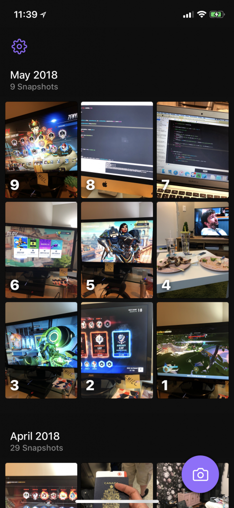
I figured I could build something simple, focused simply on capturing a single moment each day, and allowing you to easily look back upon the past. In writing this post, I have also clarified a bit of my intention behind this product, which helped me make the decision around building a collage feature. At the end of each month (or whenever you want, really), you can generate a collage of all photos of that month. It’s meant to give you that high-level view for possibly spotting patterns, but also for just having as a reference point in your past. Maybe it will trigger a memory in the future.
Decisions
When building Snapshot, I had to make some key product decisions. Here are a few that stood out to me:
- Can you take more than one photo a day?
- No. This would be counter to my vision for the app. While I debated this back and forth initially, and allowing it during my personal test period, I think that moves too closely into a photo/camera app, and less of the original experiment.
- Can you take a past photo or add from camera roll?
- No. One of the key pieces of this product is the serendipitous/in-the-moment nature of it. While this does mean you may miss photos, the hope is that you make time to capture something at that time. A down-stream effect of this decision, was to not show empty days as that might create a feeling of guilt within the experience. If you miss a day, oh well, carry on tomorrow.
- Can you customize the time that you want to take your daily photo?
- Yes and No. I allow you to take the photo at any time, but only once per day. I have missed 8:36 far too many times, having to take it at any point from 8:40 until when I sleep. However, the daily remind will always be at 8:36pm, as was originally intended.
- Should I allow Live Photos?
- No. This would create massive technical complexity as I “rebuilt” (generous term), a live camera view for taking photos. This way, taking a photo would be quick and simple, and keep you in the app at all times. It also gave me more control over the size of the photo (not landscape, etc).
- How many photos should I show at once in the grid view?
- This decision was a bit of a cop-out, as I simply created a setting for this. Depending on your screen size, you may want to shrink the grid to see more or less. One decision I did make was to remove the 1-photo-per-row option, which created something like an Instagram feed. That was too much like a photo-sharing app and again, not in line with the original vision.
- At what quality should I store the photos?
- This was an interesting choice that had multiple inputs. As a result, I initially allowed you to configure quality in Settings.
- Speed vs. Quality (saving and capture)
- Storage vs. Quality
- How were these photos being stored?
- I tried by best to balance Speed vs. Quality vs. Storage size by choosing a bit on the higher end of quality. I wanted to still optimize for storage, as the photos would be stored in the app’s sandbox, instead of the camera roll. My biggest reason for this was that the type of photos you take are often quick shots, repetitive in nature, and lacking enough context to be worthy of sitting in the camera roll. The downside to this is that currently, there is no cloud backup for photos – if you delete the app, they are gone.
- I still allow people to export the photos individually if they wish to save it/find it worthy of sharing. This meant that the quality needed to be good enough to be seen at potentially larger sizes.
- I also allow you to enable “Save to Camera Roll” in Settings, since if that is something you desire, it would be a hassle to export every time. The downside of this is you are now doubling up on space.
- This was an interesting choice that had multiple inputs. As a result, I initially allowed you to configure quality in Settings.
One of the things I have been thinking about lately is “what does opinionated design mean?” and “is it in conflict with approachable or accessible design?”. I don’t think I have an answer to that, but this project gave me a good practice arena for making more opinionated decisions, forcing the user to do things the way I feel is best or is in the spirit of what I want the app to accomplish.
Again, unsurprisingly, writing about these decisions helps me think through my actual decision-making process, hopefully reinforcing and solidifying my choices.
Lessons
The process of building this app was interesting for me, not because I built another app, but because it allowed me to reflect upon my own daily routines. If nothing else, the process enabled me to build a habit of taking my nightly photo. In the past 18 months, I think I have missed under 10 days.
If I look at my own photos, there are a few clear patterns.
- I spent a lot of evening time in front of a screen: TV or PS4. Note: this is rarely alone, Liz and I usually play together.
- I can pinpoint the turning point from when we stopped playing Call of Duty and started playing Overwatch based on photos
- I can usually tell when we are on vacation or I’m travelling for work
Screenshots/Design

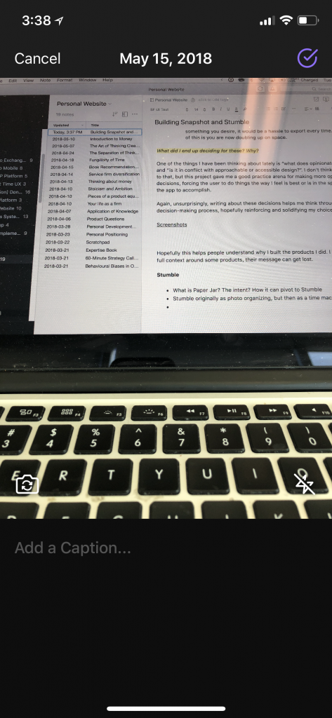
The app is designed in a fairly functional way. No real flourishes, as visual aesthetics aren’t my strong suit. I stuck to a simple colour palette and kept a fairly simple hierarchy. There are some things I still don’t love, like the Photo button as well as the Capture button on the new entry screen. I love how it looks, but it clearly doesn’t fit with the app. I am proud of where it ended up, despite its elementary nature.


Hopefully this helps you understand why I built Snapshot. I believe that without full context around some products, their message can get lost.
