For the past few months I have been working on building a couple photo-based apps. Each came about differently and I thought it would be helpful, mostly for myself, to try to articulate my own intention behind each of them. These apps were built specifically for my own needs, and polished up as a way of practicing that latter half of a project process – finishing.
The apps were built off ideas, discussions, and feedback from a variety of people so I don’t claim to have come up with everything on my own.
My last post was about Snapshot, my daily photo app.
Idea/Vision
What: Serendipitous reflection of personal memories.
How: Revisit a small selection of past photos from your Camera Roll.
Why: Better understand yourself, how you spend your time, and moments you felt were important.
Genesis
Stumble came around based on a multiple ideas, combining serendipitously.
Chapter 1: Several years ago when Dylan and I were first making apps, we had this idea for Paper Jar, a simple app that allowed you to store memories you want to remember, and have the ability to randomly pull a memory in the future to be reminded of that moment. It was based off this idea, and we had a fully functioning, lightly designed version. We never got around to releasing it and in all the time I had it on my phone, I barely used it. I found it hard to actually remember to write down or capture moments that I wanted to remember, so my paper jar was typically empty. I think the manual entry was a barrier to using the product. This is likely why I have found more success using a product like Gyroscope instead of Reporter. Despite being really interesting in the idea of data collection and personal analytics, I couldn’t build a habit around it.
Chapter 2: A couple years ago, I think after I first got a 64GB iPhone (upgrading from the 16GB), I noticed I had thousands of photos on my iPhone. This was not a reflection of my photography hobby or skill, just a habit I had of taking hundreds of screenshots or trying to capture a single moment with 5-10 photos. Duplicates, blurry shots, irrelevant screenshots, I needed a way to clean it up. I thought about building an app that allowed for cleaning up your Camera Roll, but found one (the name escapes me now) that scans your Camera Roll and identifies duplicates and blurry images, and suggests deleting them. Instead of building my own, I found an option that worked for me and used it to clean things up. It solved my needs, but was a mechanical/utility driven product, something relevant for Stumble.
Chapter 3: In February of this year I took a great course called Building a Second Brain. It was about storing knowledge in a secondary tool, freeing up capacity in your brain for creative tasks and thinking. One of the cool tools that was built to augment your “second brain” was called RandomNote. It would pull a random note from your Evernote (second brain). It acted as an engine of inspiration, allowing you to revisit past notes in a serendipitous way, potentially triggering new connections.
As you can see, each of these chapters was leading up to what ended up as Stumble. Stumble takes advantage of our new, natural behaviour of taking photos of things we want to remember. This input and data collection doesn’t depend on remembering to open a custom app – it builds off something we already do. By allowing you to revisit past photos, you can delete it if necessary, or simply be reminded of that photoworthy moment once more.
Chapter 4: From there, I spent ~4 hours on a weekend building the first, fully functional version. From there I iterated slightly on the design, and added some nice to have features. It’s pretty crazy that I finished it all so quickly, albeit with a dead-simple and ugly-to-most design.
I describe Stumble as serendipity on demand. It’s a time machine into moments you felt were photo-worthy. It works best if you have a fairly cluttered, robust camera roll to pick from.
Product Decisions
When building Stumble, I had to make some product decisions. Here are some of them:
- Should there be metadata at all? What?
- Yes. Context is one of the most important parts of appreciating the photos. Sometimes they are good enough to spark a memory or enjoy on their own, but I find added context such as the date or the location can help paint the full picture.
- Should I make the metadata (location) interactive?
- Yes. Right now metadata can return specific addresses, landmarks, or regions, depending on where the photo was taken and what the Maps API returns. When testing the app out for myself, I found myself usually wanting to tap on the link to figure out where that location actually was. Maybe in the future the map could appear in 3D Touch or further down the page.
- Should you be able to share the photos?
- Yes. This one I waffled on a bit, however again, through usage, I found myself wanting to share old photos with my partner. I could have screenshotted and shared, but it just felt so wrong when I had control over adding this quite easily. A resulting question was should I include metadata when sharing?
- How many random photos should you get? In what timespan?
- The number I decided on was 3 photos per day. Initially, it was one photo per day, but given the number of bad photos you may have (such as random screenshots or blurry picture), it makes the experience quite disappointing. This led me to introduce the ability to refresh the current photo, to access the others. This interaction made it feel a bit “game like”, as the app crawls through your phone for a new photo.
- An additional tweak in the refresh interaction was a forced delay of ~0.75s when refreshing so it felt a little more intentional, as if the app was picking something good for you.
- The last implication was the introduction of notifications as a way to bring you back into the app. I wanted them to feel random, so I made it schedule a notification for a random time between 3-7 days in the future. I made sure they happened roughly between 9am and 9pm. You can still come back and browse, but you could also a reminder at a random time in the future. I tried my best to consider serendipity when making decisions.
- The number I decided on was 3 photos per day. Initially, it was one photo per day, but given the number of bad photos you may have (such as random screenshots or blurry picture), it makes the experience quite disappointing. This led me to introduce the ability to refresh the current photo, to access the others. This interaction made it feel a bit “game like”, as the app crawls through your phone for a new photo.
- Can you interact with photos at all?
- Yes. I introduced the ability to favourite photos, which acts the same way marking a favourite does in the Photos app. When using the app, I kept wanting an action once I saw a photo I liked. It was weird that all I could do was not-delete it. Maybe this expectation was conditioned by Instagram and Twitter? I felt like I needed an interaction to demonstrate my reaction.
Lessons
- It was interesting to see how much of my expectations were shaped by past experienceswith products. I would expect to be able to interact with photos, tap for more details, etc.
- A lot of features were shaped and determined by using the app. After having the rough core of random photos, new expectations that supported the original intent started to materialize as I stumbled through my own past photos.
Screenshots/Design
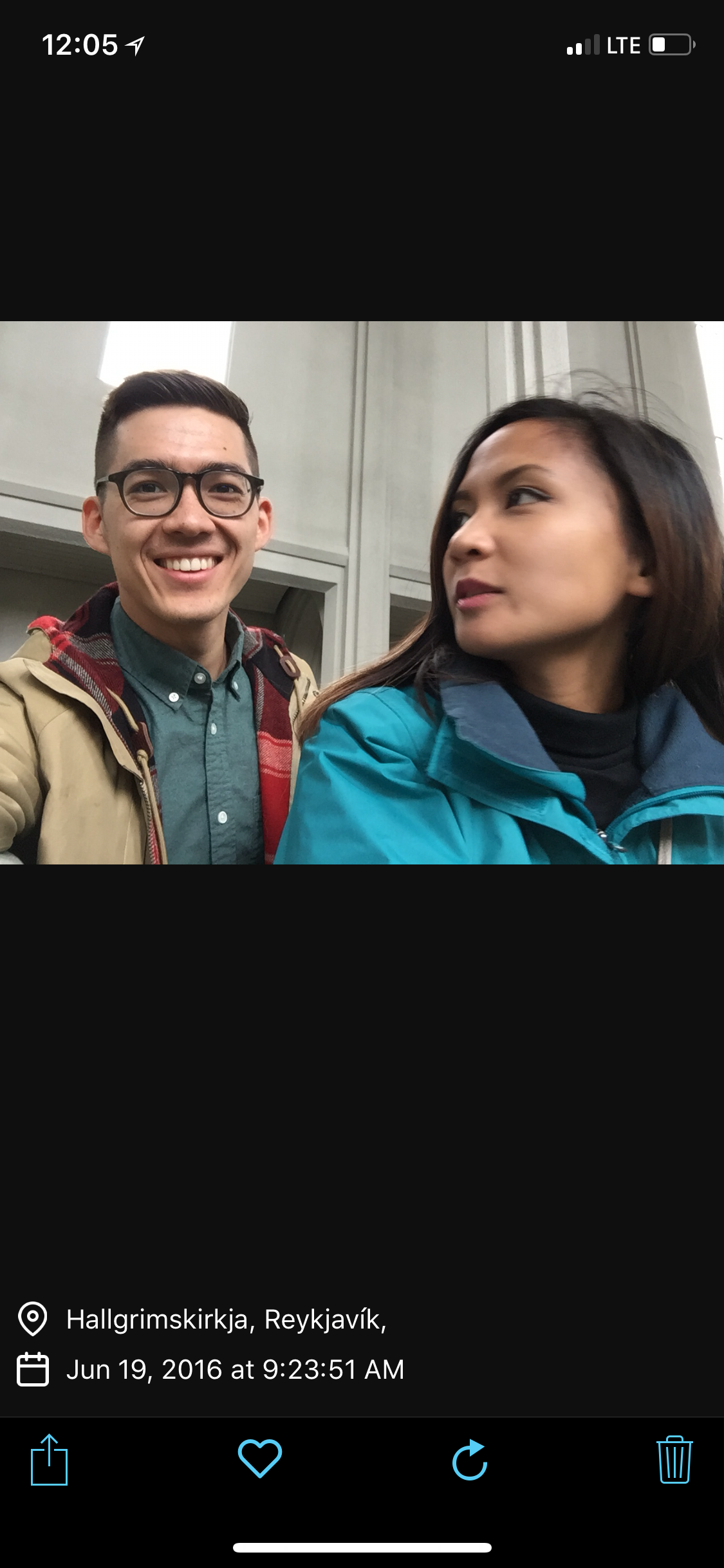
Stumble is a dead simple, single page app, so there isn’t much of UI.


Hopefully this helps people understand why I built the products I did. I believe that without full context around some products, their message can get lost.
If you have questions or want to test out the app, let me know!
